Matplotlib in Python (Part 2): Advanced Plotting & Customization Guide 34/100 Days

Matplotlib in Python

And now you get a scatter plot and here you can see that on the x-axis we have the price and on the Y we have the earnings and now you will see that we have a bar chart and that is absolutely ridiculous so let’s improve this this is how you can make vertical and horizontal bar charts it depends on you that when you have more quantities on the x-axis and when you run this you will see that we have a histogram so now we want to create a pie chart which displays that what is the percentage of every sector

right so so you will see that you have a pie chart and now when you hit shift enter you will see that you have percentage for each category right list and when you ship enter you will see that it has been explored Hello friends welcome back to day 34 of the 100 days of hell with python Alco trading today we’ll be covering the mat plot lib part two and we’ll try to cover the whole library in today’s video in previous video we have covered about the 2D line plots and today we will cover the the scatter plot

the bar plot the histogram and the pie chart and we will also try to cover some Advanced plotting techniques of the Matt BL lip library and also actually we have few more libraries that is seor and plotly so those libraries we will cover in the Midway of the course because whenever we feel it is required we will learn those libraries along the way and one more thing I would like to ask that what should we start after this Library shall we start the basic mathematics for the machine learning because that is

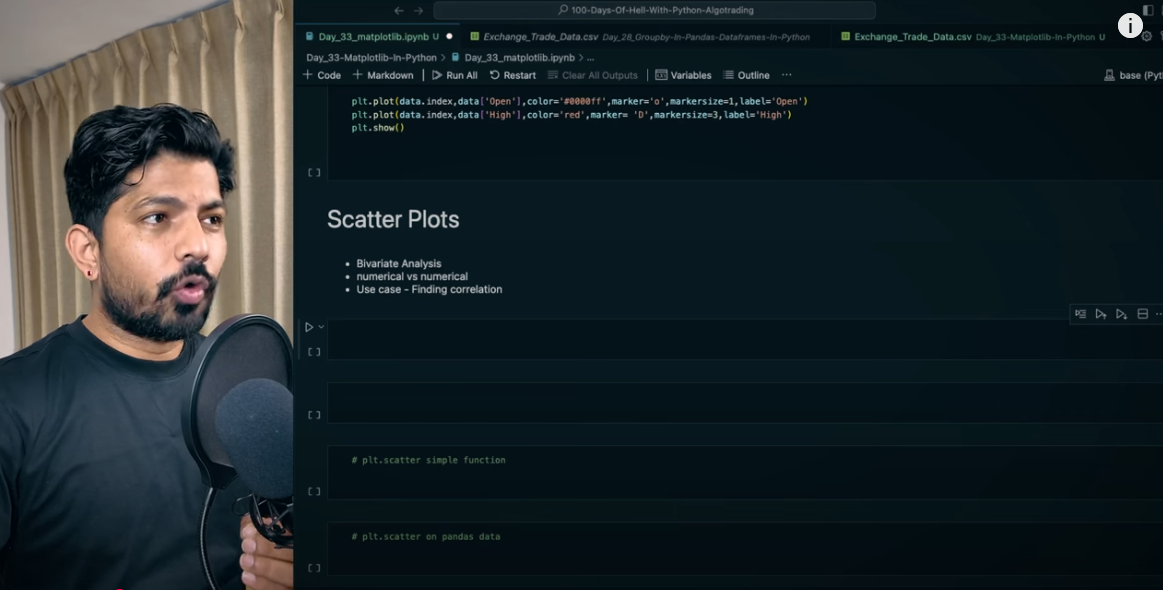
what is asked mostly in the Quant interviews but if you want that I should start straight away the algo trading strategies the techniques then you can let me know in the comments and we’ll plan accordingly so without a further Ado let’s get started so let’s Now understand about the Scatter Plots so we have seen that we can plot the Scatter Plots for the by variate analysis right and Scatter Plots is for the numerical versus numerical it can be used to find the correlation between the two values let me show you

how so for the scle plots what we’ll do we’ll use the existing data set let me show you which we have seen previously that is the constituents financials right so let’s use that first import the CSU file and you will see that we have the S&P 500 data in this so I’ll store this in the df1 and let’s try to find out the relation between the price and earning so what I’ll do here I’ll go ahead and write PLT do scatter and here we can provide the series first the series for the price and second is the series for the

Earnings and share or we can say the columns so I’ll go here and I’ll write price and DF earnings let me copy and paste because sometime what happens if we have space then it might also create issue I’ll show you how to clean the data in the future videos okay so now when we run this we get DF is not defined so what we can do we can just write one because we uh assigned df1 and now you get a scatter plot and here you can see that on the x-axis we have the price and on the Y we have the earnings right so this

way you can find the correlation you can see here right clearly let me improve this plot so for that what we can do we can simply write PLT dot figure and and here you can provide the figure size that is fix size and you can give let’s say 10 by six and you will see that it has improved right then you can also give let’s say what is the name of this plot right because it has to be understandable right so plot. title and you can provide let’s say relation between price and earnings right and when you run this you will see the title

here again you can also write the PLT do X label which is price and for the Y label you can write the earnings right so and you will see that you have price and earnings on the X and Y AIS right and similarly here is a technical text so for that we have already seen in the previous session that we can just write plot. show and it will go away correct I guess it is done and one more thing I would like to tell you that these dots are nothing in the 2D line we have seen that when we connect these dots it becomes a line

plot right so it’s the same almost but here you can find the relation between the two values easily right okay now let’s quickly move to the bar chart okay so bar chart is also for the B variate analysis and it is plotted between the numerical versus categorical right and the use case of by chart is the aggregate analysis on the groups right okay now let’s say we take the same example so I’ll print the DF here right and what we’ll do we’ll try to draw the bar chart for the name of the companies and their market cap right so

here we are drawing the bar chart between a categorical value and a numerical value so let’s do that so what I’ll do I’ll quickly go ahead and we’ll write blot Ro bar and here we can pass both the columns so the first is DF that is the name of the companies on the x-axis and then DF market cap right that is on the y- axis so when you hit shift enter you will see that it says DF is not defined yes because it is df1 and now you will see that we have a bar chart and that is absolutely ridiculous so let’s improve this so how we can do

that we have multiple options the first option is here we can just take the 50 values right I’ll just copy and paste this here and now you will see that so instead of 50 we’ll take only 25 values and now you will see that it is little bit better and now let’s make it more appealing right so for that what we can do first of all we’ll write plot. figure and here we’ll again give the fix size right and you will see that it has little bit improved now you can also give plot dot I’ll just go here and copy

these values right these are same so in title we can say market cap of various companies or we can say market cap of uh SNP 500 when you run this you will see that here we have the name of the company and here is the market cap but here we cannot see the name of company we have to make it better right so for that what you can do you can simply write plot. X scks these are all scks on the x-axis right so X sticks and now you can write rotation is equals to 45 right and now when you run this you will see

that it has been rotated 45° let’s rotate this a little bit more so I’ll just make it let’s say 70 yeah now it’s much better and let me make it 90 yeah in 90 it is fine uh it is visible clearly so this is how you can plot the bar chart and it is also very useful so now there is one problem that here you have multiple companies let’s say if it was increased from 25 to 50 then what you will do let me make it 50 so I’ll just change from 25 to 50 and you will see that now like it is not that much appealing so for that what

Matplotlib in Python
Matplotlib in Python1
Matplotlib in Python3
Matplotlib in Python6
Matplotlib in Python8

You’re going to do generally when you have more values in the x-axis what you do you just rotate the graph means these values will go to the y- Axis or you can say that you will create a horizontal chart right and for that it is absolutely simple you can just go here and instead of bar you just have to write bar H right and when you hit shift enter and you will see that now the chart is horizontal and for now let me comment out this let’s increase the figure so let’s say from 10 to we can make it 20 and here also from 6 to we

can make it 12 20 by 12 yeah now it is much better right than that this is how you can make vertical and horizontal bar charts it depends on you that when you have more quantities on the xaxis you just make a horizontal bar chart okay now you can also control the color and labels let me show you how so let’s say we have this chart here I’ll just copy and paste it here and here what I’ll do in the bar H I’ll change the color now it is blue let’s say to red and when you run this you will see that the values

has been changed from Blue to Red it’s very easy like it’s same for almost all the charts all the bar all type of bars and you just need to change like from bar to Pi or plot or histogram basically this value will be changed rest all remains almost same next we have is the histogram so for histogram if you do trading then you know that generally when we apply macd moving average convergence Divergence that time we have a histogram like you can see a signal line you can see a a magd line and then on the bottom you

have a histogram right let me show you how so in histogram we have only univariate analysis right and it can be applied on only on the numerical columns and the use case is the frequency count right let me show you how so this is the formula for the uh mscd I have already written it here I’ll show you in the future how to calculate all these kind of technical indicators like mscd and all of the rest signals will understand them thoroughly in the future so for now I have already done that on the data

data frame if you remember we fesh this data from the yaho finance let me show you I’ll just print the data here in the above section we have done that previously yesterday so here we have the Open high low close Adent Clos and volume which we Fest and these columns I created ema2 with this ema26 mscd signal line and the MSD histogram so now we want to print the histogram so that is easy absolutely so for that what we can do I can simply go here and write plots. hist and here you can pass this histogram column so histogram is nothing

but the difference between the mscd and the signal line if you’re not understanding don’t worry you will not get it right now we are just understanding how to draw a histogram in future we will understand all the technicalities inside that so HT and you have to pass inside the data right and when you run this you will see that we have a histogram and here you can also control the bins let’s say I write here bins means it will divide the data into bins so when I write 20 so here we divided that data into 20 bins right you

can make it more better as always like you can give the title name you can give the X label you can give the Y label okay next we have is the pie chart so pie chart is for both the univariate and B variate analysis and it is generally used for the categorical versus numerical data and the use case is to find the contribution on a standard scale like you will be having a circle and inside that you can represent the percentage of every categories so let’s again draw let’s say we have df1 so what we will do we’ll try

to find out the sectors so sector is a categorical column right so what we’ll do I’ll just write sector here and we have this series correct and here what we can do we can find the value counts so you will see that we have these values means so here what you can see that we have 84 companies in the consumer discretionary sector then we have 70 companies in the information technology and then 68 in the financial and so on so forth so now we want to create a pie chart which displays that what is the percentage of every sector

right so what we will do I’ll just assign a new variable to this let’s say sector right and then I can write like plot uh PLT do plot and I can pass sector here right and when you shift enter okay not plot actually it is pi my bad so you will see that you have a piie chart right but now there are so many unnecessary things so for that what you can do you have multiple options so let’s understand them one by one okay so first of all we will remove these details I have already shown you how we can do that you can just write plot.

Show it will be G then you can also like uh display the labels here so for that what you will do you will write labels and then sector do index and it says index object is not available I have to remove this parenthesis from here and now you will see that we have the labels for each category you can also display the percentage of each category because now we are not able to identify that which category is how much percentage so for that you can write Auto percentage Auto per and here you have to give a

weird syntax that is 1.1 F you can give anything any value here it’s up to you and now when you hit shift enter you will see that you have percentage for each category right you can see here 13.9 for the it 16.6 is for the consumer 13.5 is for the financials okay now you can also change the colors of this so for that what you need to do let me copy and paste this here so here you have to pass the color in a list right so here we have like 1 2 3 4 5 6 7 8 9 10 11 so you have to pass a list with the 11

colors if you want to change you can do that so what you need to do you can just write Colors and you can pass a list with all the colors right it’s very easy I’m not wasting time on this for now and sometimes you might have seen the pie charts in which uh single slice is a little bit in out of side so for that you can use the explode right so how you can do that so for that what you can do you can simply write a let’s say explod list here also you have to pass a list so for that I’ll go here so we have 11

categories here right so what I’ll do I can just write like let’s say 0.3 for the first category and remaining you can give let’s say 0 0 1 2 3 4 5 6 7 8 9 and 10 and 11 right and here I’ll just copy and paste it here and here in the explode I’ll write and I can pass the list right so explode list and when you shift enter you will see that it has been explored it has been a little bit outside similarly you can give for the other values Also let’s say you want to explode 0.1 this second category you can

do that and if you want to do let’s say one for the last one so it will be completely like uh exploded right one it means the percentage so the meaning of 0.3 and 1 is the range from 0 to 1 how much you want to EXP load from the center you can say right so this is how you can create many beautiful pie charts and all the rest of the charts right and you can also change the Styles here let me show you how so like if you write here PLT do Styles and available you can see that these many styles you have and you

can apply those Styles as per your need right let’s say you want to use the MPL Gallery so what you will do you’ll just go and copy this one and here you can write plot do style and use and here you can pass that and when you H shift enter you will see that now it has been changed and when you run it again you can say it is a kind of template which will change all the charts and plots right so it depends on you that what kind of style you want to use and you can use that right now we have also option to save

the figure let’s say if you want to send this figure to someone else so for that what you can do you can save it let me show you how so what I will do I’ll just copy and paste this code here and when I display this it is the figure and to save the figure you don’t have to use the show you have to use the save fig and you can give the name right so let’s say the industries. PNG and you can see in the left side that there will be an image created a PNG image you can see here this is the industries. PNG file and

when you open this you can see here right so that’s how you can see and you can send to anyone this is cropped because of the style so you can change as in the figure size and you have so many options to change that also right so and last but not the least you have to check the documentation always for no matter for which library for which code please try to explore the official documentation because you will find so many things there and here also we cannot cover everything we will be covering only a small portion in this

limited time so if you want to explore you can go on the website and you can do that and here also we’ll try to cover those things which are frequently used which are most required right so we cover almost 80 to 90 important functions important parameters but rest also you might require and you can refer to the official documentation right

Watch this Day 34 video tutorial

Day 34: Matplotlib In Python Part 2

1. Which matplotlib function is used to create a new figure for plotting algorithmic trading data?

2. How can you change the style of plots globally in matplotlib?

3. What is the purpose of the ‘plt.subplots()’ function in matplotlib when plotting trading data?

4. Which parameter in the ‘plt.plot()’ function allows you to set the color of the line in a trading plot?

5. How do you create a pie chart in matplotlib with percentages for a trading portfolio?

6. Which parameter in the ‘plt.pie()’ function allows you to explode a slice in a pie chart?

7. How can you change the font size of the labels in a pie chart created with matplotlib?

8. What is the best way to display multiple plots in a single figure in matplotlib?

9. Which function in matplotlib is used to add a legend to a trading plot?

10. How can you change the line style in a matplotlib plot?

11. Which function in matplotlib allows you to save the current figure as an image file?

12. How can you create a scatter plot with different marker sizes in matplotlib?

13. What is the purpose of the ‘plt.tight_layout()’ function in matplotlib?

14. How do you add grid lines to a plot in matplotlib?

15. Which function is used to set the title of a plot in matplotlib?

16. How can you set the x and y axis labels in a matplotlib plot?

17. What parameter would you use to set the transparency of a plot in matplotlib?

18. How do you create a subplot in a specific position in a matplotlib figure?

19. Which function is used to display the plot interactively in matplotlib?

20. How can you change the figure size in matplotlib?